
|
ATS > Software > Web Programming > Static Web Content |
|
|
|
||
|
||||
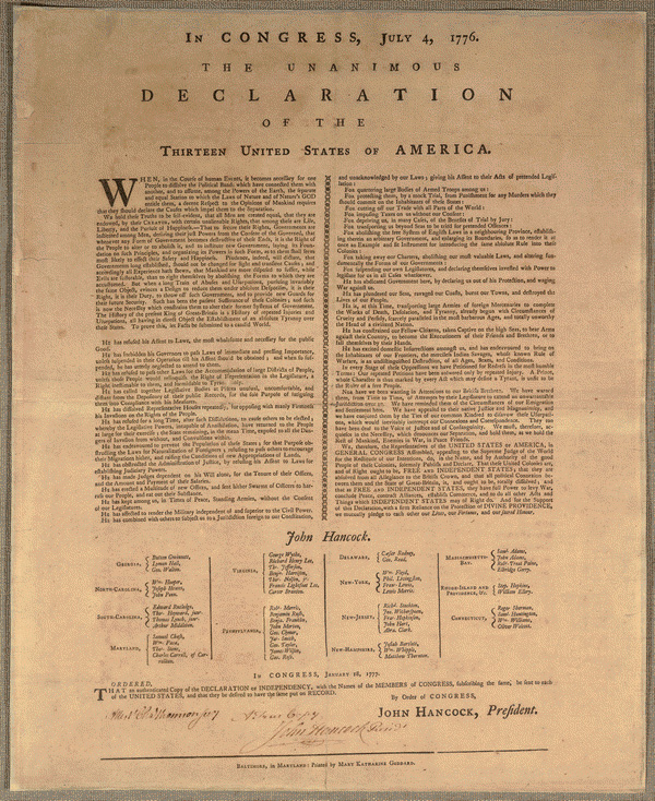
The World-Wide Web is a set of computer technologies that publish and view information over the Internet in a highly interactive manner. This information, commonly text, graphics, audio, and video, is structured using the HyperText Markup Language (HTML), styled using Cascading Style Sheets (CSS), and made dynamic using the programming language JavaScript. Together these three technologies are known as Dynamic HTML (DHTML). Additional technologies can be used with HTML, such as Scalable Vector Graphics (SVG) for displaying geometric shapes (similar to Adobe Illustrator). This course also provides examples of the use of the JavaScript library D3 (Data-Driven Documents), which provides a convenient application programming interface (API) for displaying data on the Web, making it somewhat simpler to use these technologies. It is similar to the popular jQuery library but focuses on data processing. D3 is designed to provide interactive tools to help explain your data to other people; if you are still exploring its characteristics or simply need a static graphic for a thesis, D3 is not for you (it is almost far from a “chart wizard” as you’re going to get). Many examples are displayed on the D3 web site: http://d3js.org/. A helpful source on the use of D3 is the book Interactive Data Visualization for the Web; an online version is available at http://chimera.labs.oreilly.com/books/1230000000345/pr01.html , but you may also want to purchase a physical copy from O’Reilly.
Getting StartedWeb publishing, generally speaking, consists of three steps:
Editing Web PagesThere are a large number of applications that help one edit HTML, CSS, and JavaScript (as well as other programming languages). They can be as simple as text editors with syntax highlighting, or they can be what-you-see-is-what-you-get (WYSIWYG) editors, or they can be full-blown Integrated Development Environments (IDEs). Since the emphasis in this course will be on general methods, no specific editors are required. Here are a few possibilities, one or more of which you should download and install: Macintosh:
Windows:
Cross-platform:
Reviewing Web PagesMaking sure your Web pages accurately display your content and design requires that you review them with actual Web browsers, even if you are using a WYSIWYG editor like BlueGriffon or Dreamweaver. Unfortunately there are variations in how browsers interpret Web languages, so it is advisable to review your pages in several of them to check for discrepancies. Older browsers are more likely to have issues, especially with the latest standards, so we’ll assume users are up-to-date or can get up-to-date if they need to: Macintosh:
Windows:
Cross-platform:
To test for specific browser capabilities, visit the site http://caniuse.com/. Try it out by, for example, searching for the new image format WebP. Static Web pages, as well as many dynamic pages, can remain as files on your personal computer and be read and displayed properly by your browser alone. When Web pages become more complex, for example when they are constructed on the fly after pulling information from a database, it’s necessary to load them from a Web location rather than a file, so that a Web server can process them first. Web servers can run on your local computer to provide a testing environment for your pages. There are a number of of open source Web servers available, but for this course we’ll use a relatively new, lightweight server called Node.js. You can download and install Node.js on most personal computers if they aren’t too old. If you aren’t able to install it, you can use a remote server instead (see the next section). Publishing Web PagesFor others to see your Web pages, you’ll need to publish them on a dedicated Web server that is always on and ready to share your pages with the world. Amherst College provides every member of its community with web space for “traditional” web pages on a Unix web server. Your traditional web space has the web address (URL) You can request a traditional web page by contacting AskIT@amherst.edu. You can put your web pages where others can see them using Internet protocols such as Secure File Transfer Protocol (SFTP) or Secure Copy (SCP): Macintosh:
Windows:Cross-platform:
You can sometimes also mount a network disk from a remote server using the Common Internet File System (CIFS) — also called System Message Block (SMB). In this case your disk space on the remote computer will appear on your desktop, just like your Userfiles or U: drive, and you’ll simply copy the edited page over to it as you would move around any other file. This capability is built-in to most operating systems: Macintosh:
Windows:
We often refer to your personal web space as your W: drive; more complete instructions for accessing it:
Pay particular attention to the details about correcting permissions on the Unix web server. Note that the main College web server HyperText Markup Language (HTML)The HyperText Markup Language (HTML) is designed to give your information semantic structure that can be understood by both people and computers. The full specification of HTML 5.0.
|
| Massachusetts Bay | Samuel Adams |
| John Adams | |
| Robert Treat Paine | |
| Elbridge Gerry | |
| Rhode Island and Providence, &c. | Stephen Hopkins |
| William Ellery |
The spacing between elements here is for ease of interpretation by the programmer; a browser will ignore them.
In general, every row should have the same number of data cells to ensure that items in the same column stack up properly.
In this case, however, the first column makes use of an extra setting in the form of an attribute = value pair, rowspan=n, to extend a data cell downward through multiple rows. In such spans there should be a data cell only in the first row.
A table may also have a caption <caption>, a header <thead>, and a footer <tfoot>.
Note that HTML ignores multiple spaces, tabs, and newlines in the text, replacing any contiguous group of such white space with a single space. So, for example, the line breaks and horizontal spacing in the content above, which are added for clarity, are replaced with single spaces.
Different elements are also displayed differently:
HTML includes several ways to mix graphic content with text. These elements generally consist of single tags, in the format:
<tag />
A common graphic device to visually separate blocks of text is provided by a horizontal rule <hr>:
<hr />
<p>Baltimore, in Maryland: Printed by Mary Katharine Goddard.</p>
Baltimore, in Maryland: Printed by Mary Katharine Goddard.
Horizontal rules by default have a block-level display (like paragraphs).
There are times when introducing a line break <br /> at a particular point to force a new line can help clarify or emphasize text:
<p><em>Ordered</em>,<br />
<strong>That</strong> an authenticated Copy of the <strong>Declaration</strong> of <strong>Independency</strong>, with the Names of the <strong>Members</strong> of <strong>Congress</strong>, subscribing the same, be sent to each of the <strong>United States</strong>, and that they be desired to have the same put on <strong>Record</strong>.</p>
<p>By order of <strong>Congress</strong>,<br />
John Hancock, President</p>
Ordered,
That an authenticated Copy of the Declaration of Independency, with the Names of the Members of Congress, subscribing the same, be sent to each of the United States, and that they be desired to have the same put on Record.
By order of Congress,
John Hancock, President
Note: Line breaks should not be used as a substitute for paragraphs! They are intended to be used inline, like phrase elements, and provide visual formatting, but they have no inherent meaning themselves (other than suggesting importance for what is set off). If you are introducing a new paragraph, use </p><p> instead, since these tags add meaning along with the visual separation.
Mixing images into text can greatly enhance content by providing visual examples.
Images can be pulled from any location on the Web or on your computer by providing an <img /> tag together with the attribute src, whose value is an Internet address (beginning with http:// or https:// ), or a file name:
<h3 class=signer>
<img src="https://cdn.loc.gov/service/pnp/cph/3a30000/3a30000/3a30000/3a30084_150px.jpg"
title="John Hancock, an Engraving by J.B. Longacre from a Painting by Copley"
alt="Portrait of John Hancock, facing right."
/>
John Hancock.
</h3>
<p>
<img src="https://cdn.loc.gov/service/pnp/cph/3a30000/3a30000/3a30000/3a30084_150px.jpg"
width=244
title="John Hancock, an Engraving by J.B. Longacre from a Painting by Copley"
alt="Portrait of John Hancock, facing right."
/>
By order of Congress,<br />
John Hancock, President<br />
<img src=john_hancock_signature.jpg
width=23%
title="John Hancock’s Signature"
alt="John Hancock’s Signature, from the Original Declaration of Independence"
/>
</p>
John Hancock.
By order of Congress,
John Hancock, President

In both of the above cases the images are in JPEG format. With just a file name as the value for the second src attribute, it must be located in the same folder as the Web page, i.e. they are siblings.
If attribute values contain spaces, quotes, /, =, <, or >, then they must be quoted with either single or double quotes (traditionally the latter, but never the same type as any embedded quotes).
Images have a particular width and height in pixels, 207×57 in the first case and 122×150 in the second. But the attributes width and height can be used to set different dimensions with values that are either numbers (expressing pixels) or as a percent of the page width (note what happens to the image as you change the page size). If only one of the two attributes is declared, the image will be scaled proportionally.
The title tag provides a brief description that will pop up when you point at (not click on) an image. Try it!
The alt tag is important for those with visual handicaps, as it will be read aloud by screen readers and without it the image will be ignored. It should always be included to provide an extended textual description of what the image shows, if that is not obvious from the title or included elsewhere in the document (such as in a caption).
Images by default have an inline display (like text and phrase elements), and they flow along with the text with which they are mixed.
When writing an HTML document, there are a number of elements that should be included to help define the characteristics of the document. A minimal HTML document is:
<!DOCTYPE HTML>
<html>
<head>
</head>
<body>
</body>
</html>
The content we have been writing above goes between the <body>…</body> tags, e.g.
<!DOCTYPE HTML>
<html lang=en>
<head>
<meta charset="UTF-8" />
<title>The Declaration of Independence</title>
<meta name="author" content="Thomas Jefferson" />
<meta name="date" content="July 4, 1776" />
</head>
<body>
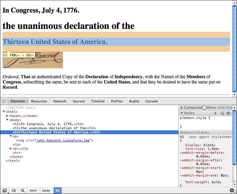
<h2>In Congress, July 4, 1776.</h2>
<h1>the unanimous declaration of the</h1>
<h2>Thirteen United States of America.</h2>
<p><img src="john_hancock_signature.jpg" width="30%" /></p>
<p><em>Ordered</em>,</p>
<p>
<strong>That</strong> an authenticated Copy of the
<strong>Declaration</strong> of <strong>Independency</strong>,
with the Names of the <strong>Members</strong> of <strong>Congress</strong>,
subscribing the same, be sent to each of the <strong>United States</strong>,
and that they be desired to have the same put on <strong>Record</strong>.
</p>
<hr />
</body>
</html>
Here we can clearly see the hierarchical structure of an HTML document, with many elements being containers of content and other elements.
The <html> element indicates that the content it contains is the HTML portion of the document, and in addition has an attribute-value pair that declares that the language used is English.
The <head> element contains code that is not intended for display within the main web page, including:
<meta> elements providing information about the document itself (known as metadata), such as:<title> to be displayed as the title of a browser window or tab;<style> elements for CSS styling instructions (to be discussed later);<script> elements for JavaScript programming code that doesn’t depend on specific elements defined in the body (also to be discussed later).One other important type of “nondisplayed” data are comments, which are explanatory bits of text about what’s happening in a document. They are single tags with the following format:
<!-- This is an HTML comment. -->
If anything you are writing is more than routine, it’s a good idea to include a comment to explain your intentions.
Modern web browsers provide a means to inspect both the content and detailed structure of web pages.
To see the underlying source code as first loaded by a browser:
Safari > Preferences…;Develop > Show Page Source;Tools > Browser Tools > Page Source;⠇ > More Tools > Developer Tools > Sources.⠇ > More Tools > Developer Tools > Sources.To see the detailed structure of the code as interpreted by the browser, including changes made by Javascript, open the document inspector:
Safari > Preferences…;Tools > Browser Tools > Web Developer Tools > Inspector;⠇ > More Tools > Developer Tools > Elements.In Chrome, the inspector looks like:
Notice that, as you point at or click on individual elements, they are highlighted in the display view above the inspector, and you can see the size of their container in pixels.
You can also open and close different parts of the HTML hierarchy by clicking on the triangles at the left of each element.
Notice that syntax coloring appears here, to help identify the different parts of the HTML language.
When trying to find and fix issues in your code, it can be useful to submit it to a validator which is designed to catch and flag common errors such as interlaced tags:
<p><strong>Record</p></strong>
The World Wide Web Consortium maintains a validator that you can use:
Error: End tag p seen, but there were open elements.
From line 3, column 24; to line 3, column 27
ong>Record</p></stro
Error: Unclosed element strong.
From line 3, column 10; to line 3, column 17
↩<body><p><strong>Record
Error: No strong element in scope but a strong end tag seen.
From line 3, column 28; to line 3, column 36
Record</p></strong></body
Cascading Style Sheets (CSS) let you assign styles such as font size and typeface, color, borders, margins, etc. to HTML elements, to classes of elements, or to individual elements. They can reproduce traditional typesetting styles but can also do much, much more.
The full specification of CSS 2.2.
Your Web browser makes a set of default choices about the way that different HTML elements are styled when a page is opened, and you have some ability to control that using your browser’s preferences. But most Web pages design their own styles using CSS.
CSS statements are usually placed in an HTML <style> element in the <head> element of the document, and include an HTML markup selector followed by a sequence of property: value pairs within braces, e.g.
<head>
<style>
h1 { color: red; border: solid; }
</style>
</head>
which gives all <h1> elements red text and a solid border.
You can also place styles in external files with a statement in the <head> like
<link href="doi.css" type="text/css" rel="stylesheet" />
where a link is made to a file of CSS text whose relationship is that of a stylesheet.
In such a file no <style> element is necessary.
CSS provides several ways to select the different pieces of your HTML markup for styling.The most general CSS statement is for an element selector, where the property-value pairs are preceded by the name of the element, e.g.
body { background-color: rgb(207, 175, 128); }
which applies the red-green-blue color combination (each on a scale of 0 – 255) to the background of a web page:
In Congress, July 4, 1776.
the unanimous declaration of the
Thirteen United States of America.
A shorthand for such colors uses a number sign or hash # followed by three hexadecimal (base 16) values, which have the digits 0-9 as well as A–F to represent the values 10–15. On the same scale each color value runs from 0 to FF, so this triplet of RGB values can also be written
body { background-color: #CFAF80; }
A particular font or font family could also be specified for the body element, and this will be inherited by descendants like <h1> and <p>:
body { background-color: rgb(207, 175, 128); font-family: Times, TimesNR, Georgia, serif; }
In Congress, July 4, 1776.
the unanimous declaration of the
Thirteen United States of America.
Here the browser looks for specific fonts installed on your computer in the order provided, choosing a default serif font if necessary.
Characters in a serif font have small extensions at their ends, which help distinguish the letters and improve quick recognition of whole words. Serif fonts are commonly used for long passages of text, such as the body of a document.
Probably a serif font is already the default for unstyled text in your browser, but it didn’t used to be when screen resolutions were lower so that the serifs didn’t work very well, and sans serif became the default (compare the two previous images). They are still good for short pieces of text, such as headings.
Compare the two sets of text above to see the difference!
There are a large number of ways to modify the styling of content for particular purposes. To match the styling used in the Declaration, the following CSS rules are a start:
h1 { text-transform: uppercase; font-weight: normal; font-size: medium; letter-spacing: 0.8em; }
h2 { font-variant: small-caps; letter-spacing: 0.4em; }
h4 { font-weight: normal; }
Here the letter-spacing size has been specified using an em, which is the width of the letter m in the current font.
A style set can also be applied to multiple elements by separating them with a comma:
h1, h2, h3, h4 { text-align: center; }
The document chooses to strengthen certain words by printing them in uppercase, so we can redefine the style for the <strong> element to match:
strong { text-transform: uppercase; font-weight: inherit; }
By setting font-weight to inherit, such elements will only appear bold in headings but not in paragraphs. We can then also apply this phrase element to the words “Congress” and “America” in the heading:
<h2>In <strong>Congress</strong>, July 4, 1776.</h2>
<h1>the unanimous declaration of the</h1>
<h2>Thirteen United States of <strong>America</strong>.</h2>
In Congress, July 4, 1776.
the unanimous declaration of the
Thirteen United States of America.
This markup now begins to look very similar to the real thing (yep, the Times font has been around for centuries with only small variations):
The new definition of <strong> also appears in the last few lines:
<h4>In <strong>Congress</strong>, January 18, 1777.</h4>
<p><em>Ordered</em>,<br/> <strong>That</strong> an authenticated Copy of the <strong>Declaration</strong> of <strong>Independency</strong>, with the Names of the <strong>Members</strong> of <strong>Congress</strong>, subscribing the same, be sent to each of the <strong>United States</strong>, and that they be desired to have the same put on <strong>Record</strong>.</p>
In Congress, January 18, 1777.
Ordered,
That an authenticated Copy of the Declaration of Independency, with the Names of the Members of Congress, subscribing the same, be sent to each of the United States, and that they be desired to have the same put on Record.
Often you will want to distinguish a particular type of content from the more standard formats provided by HTML elements, for example the names of the signers of the Declaration are all italicized.
You can specify this formatting by creating a class selector that begins with a period or dot, such as:
.signer { font-style: italic; }
Such classes can be applied to *any* HTML element by supplying the attribute class="signer":
<h3 class="signer">John Hancock.</h3>
John Hancock
The individual signers can also be designated as such:
<td class="signer">Samuel Adams</td>
Massachusetts Bay Samuel Adams John Adams Robert Treat Paine Elbridge Gerry. Rhode Island and Providence, &c. Stephen Hopkins William Ellery
Class styles may be restricted to particular elements by joining them together in the selector:
ul.abuse { list-style: none; text-indent: 1em; }
In this case, only unordered lists that are of class abuse will have this style applied to them, and because these properties are heritable in this case, it affects all of the list items inside the ul:
<ul class="abuse">
<li>He has refused his Assent to Laws,
the most wholesome and necessary for the public good.</li>
<li>
He has forbidden his Governors to pass Laws of immediate and pressing importance,
unless suspended in their operation till his Assent should be obtained;
and when so suspended, he has utterly neglected to attend to them.
</li>
</ul>
- He has refused his Assent to Laws, the most wholesome and necessary for the public good.
- He has forbidden his Governors to pass Laws of immediate and pressing importance, unless suspended in their operation till his Assent should be obtained; and when so suspended, he has utterly neglected to attend to them.
Note: whether or not a CSS style is inherited by descendent elements varies, and you need to consult the CSS documentation to determine which have this property and which don’t. Font styles applied to the body of a document are, for example, conveniently inherited by paragraphs.
Warning: there is a difference between these three selectors:
ul, .abuse applies either to <ul> elements or any element with class abuse;ul.abuse applies to <ul> elements with class abuse;ul .abuse applies only to elements with class abuse that are contained inside of a <ul> element.In general class names should represent the purpose of the class, as in the examples above, not the styles that are going to be applied, e.g. “red”. Then when you decide to change their style (e.g. to blue), the class name can remain the same because its meaning is the same.
In addition to the restrictions imposed on the characters used in attribute values in general, class names should always start with a letter rather than a number, and may not contain spaces.
Sometimes a style might be applied only once within a document, for example the signature at the bottom is indented halfway over.
It’s then useful to identify such specific elements using an ID selector, which begins with the hash or number sign #, possibly because more generic IDs are often numeric:
#signature { text-indent: 0; margin: 1em 0 1em 50% } /* This goes in your .css file */
<p id=signature> <!-- This goes in your .html file -->
By order of Congress,<br />
John Hancock, President<br />
<img src=john_hancock_signature.jpg
title="John Hancock’s Signature"
alt="John Hancock’s Signature, from the Original Declaration of Independence"
/>
</p>
For the margin property, which controls the space or margin around an element, the size value(s) are applied in the order top—right—bottom—left, repeating earlier items if not all are provided; here it adds space at the top and bottom to separate the previous and subsequent phrases of the text, and indents it by 50% into the page.
By order of Congress,
John Hancock, President
 Many elements such as headings also have, by default, some space or margin around them, which lies outside their border and is always transparent.
The CSS box model, shown in the image to the right, demonstrates the relative positioning of the the content, the padding, the border, and the margin.
The margins of adjacent elements always overlap each other, so that the result has the size of the maximum of the two margins.
Another example of using an id attribute would be with the word Declaration, which is set in a unique way relative to its surrounding text:
Here the margins can be set with only two specifications, the top and right, which are then repeated to also apply to the bottom and left:
#declaration {
font-size: x-large;
letter-spacing: 1.2em;
display: block;
margin: 1em 0;
}
This selector will be applied to the first element that has an attribute id="declaration".
An arbitrary set of content can be designated using the generic inline element <span>, which has no default styling (classes can also be used this way):
<span id="declaration">declaration</span>
In Congress, July 4, 1776.
the unanimous Declaration of the
Thirteen United States of America.
Note that the display property is changed for this particular <span> to be block rather than inline, so it ends up on its own line.
Again, id attributes can be used with any element, whether a paragraph or a phrase element, but they should be unique within a document.
Like class names, id values should conform to the restrictions imposed on the characters used in attribute values in general, always start with a letter rather than a number, and may not contain spaces.
An alternative to an ID selector for applying a style to a single element is the style attribute, which directly lists the style definitions in the HTML:
<span style="font-size: larger; display: block; margin: 1em 0;">declaration</span>
An ID selector is usually a better choice, however, since it lets you place the style definition togther with other definitions, and allows you to give it a name that can indicate its purpose.
When a web browser combines the different rules you define for the style of a particular element, occasionally they will conflict, as in the above headers where the heading text by default is bold but may be converted to normal weight but in all capitals.
The general rules for this cascade of styles are three-part:
1) Style applications with the least amount of inheritence take precedence over more distant styles.
2) Similarly, more specific styles have precedence; from lowest to highest, these are: browser default, element selector, class selector, id selector, style attribute.
3) When two styles have the same precedence from the first two rules, the one written later in the code will have priority over the earlier one.
Remembering these three rules will help you understand the styles that appear in your document, though there can be exceptions that can be unclear.
The web inspector can help you determine which styles apply, listing the computed (final) style, as well as the cascade of rules from highest precedence to lowest:
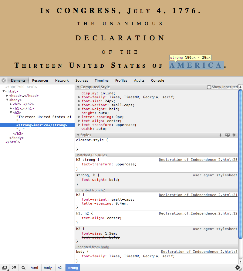
Note how bold is applied from the “user agent stylesheet”, i.e. the browser defaults, first in the <h2> element, which is then “canceled” out by the same style in the <strong> element.
As with HTML, it’s usually a good idea to provide comments that can help explain the purpose of particular arrangements of CSS styles.
Anywhere CSS is written, you can include comments in the format
/* This is a CSS comment. */
This can be particularly important if you need to explain how the cascade is expected to take place.
Add CSS to your DOI representation that will display paragraphs using the standard shown in the Declaration, where the first line is indented and there are no preceding or trailing margins.
One of the major uses of CSS is to position elements out of the normal flow of the document, for example an image or sidebar floating alongside a paragraph, or fixed relative to the document window.
The various HTML elements that we’ve discussed have followed normal “flow” behavior, where they are displayed one after another in the same order they are written in your document.
CSS provides two additional types of positioning, allowing elements to “float” relative to adjacent elements, as well as being “positioned” relative to the elements that contain them.
Since by default most content flows “normally” in an HTML document, the only difference we’ve seen in how content is displayed is that some elements like headings, paragraphs, and horizontal rules have a block-level display, starting and ending with new lines, while others like text, phrases, spans, and images have inline display, being placed in the same line as preceding and following inline elements.
This behavior can be changed with the property display, as we saw previously:
.imageStandard { display: block; width: 50%; margin-left: 25%; margin-right: 25%; }
When the image is given a block-level display, by default it has the whole width of the page to itself, and its width and margin properties can be used to position it in the center of the page.
An element can be made to float either to the far left or the far right of the element that contains or follows it, taking on a block-level display with no margins, similar to what is seen in the box model image above.
If the containing or following element has inline display, like text, it will rearrange itself to flow around the floated element, dynamically readjusting as you narrow or widen the computer screen.
Non-inline content may flow upward and be covered over; to avoid this, or to simply start a block element after the image, you can assign its container (e.g. <p>) the CSS property clear, which may have values left, right, or both, depending on the floating content it is trying to avoid.
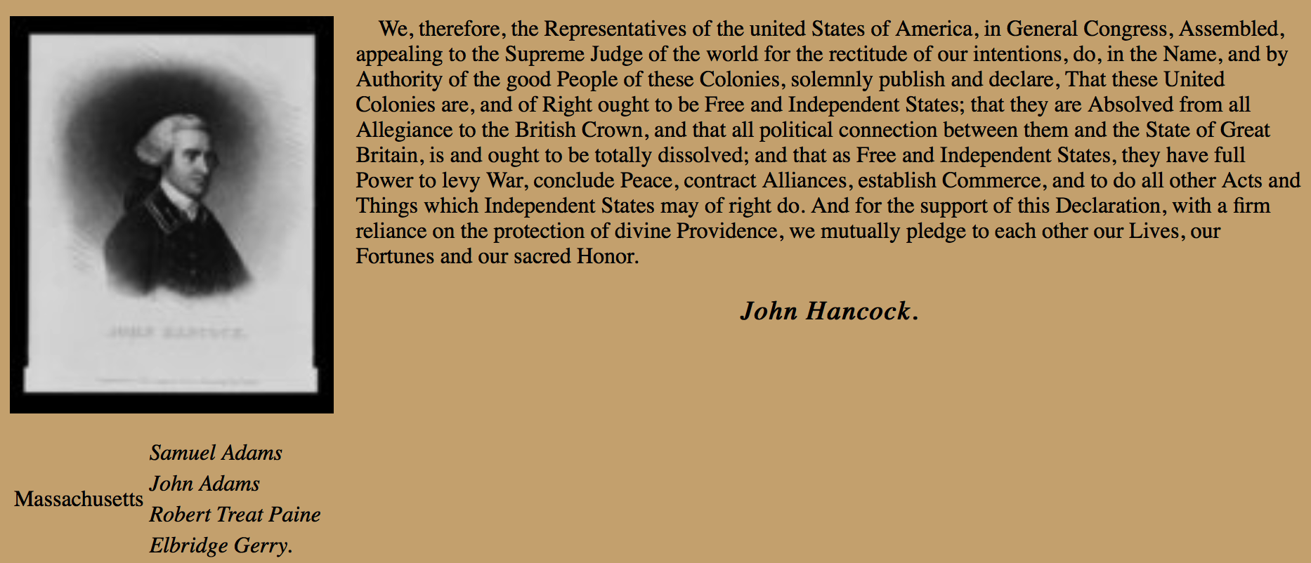
Floating an image adjacent to text is a common task:
.imagePreceding { float: left; width: 25%; margin: 0 1em 1em 0; }
.noFill { clear: both; }
<p><img class=imagePreceding … />We, therefore, the Representatives of the united States of America, … </p>
<h3 class=signer>John Hancock.</h3>
<table class=noFill>
<tbody>
<tr> <td rowspan=4>Massachusetts Bay</td> <td class="signer">Samuel Adams</td> </tr>
....
</tbody>
</table>
A margin to the right and below is added to the image to keep surrounding text from coming too close (which makes it harder to read).
Flow content and floating content are both considered to have static positioning; the essential characteristic is that they do not overlap other content, which always makes room for them.
But CSS defines several other types of positioned content, which generally speaking will overlap other content if precautions are not taken.
An element can be precisely positioned by using (x, y) coordinates in reference to a containing element, called the positioning context, and displayed in front of or behind other content, in any order you choose.
The CSS property position can be set to one of four possibilities, with static being the default flowing or floating behavior seen so far:
position: |
positioning context | display | normal flow space |
|---|---|---|---|
static flowing |
not offset | default block-level or inline | occupied |
static floating |
location within containing element | marginless block-level | filled in by following elements; inline content will flow around it |
relative |
location within containing element | default block-level or inline | retained (as blank space when moved) |
absolute |
nearest containing block-level element with relative or absolute positioning |
marginless block-level | filled in by following elements |
fixed |
browser viewing pane | marginless block-level | filled in by following elements |
For non-static elements, the properties top, bottom, left, and right let you specify their offset from any edge of the reference element. In all cases the values assigned are measured from the element’s positioning context (see the table above), “opposite” to the specified position, i.e. top is measured downward while bottom is measured upward, and left is measured rightward while right is measured leftward. Negative values are allowed and move the element in the opposite direction. Note that you should only use at most one of top or bottom, and at most one of left or right.
In relative positioning, the element is simply shifted in position, leaving behind a blank space. The element will appear above and hide other content that it overlaps. It is therefore not very useful, except as a reference point for absolutely positioned content.
In absolute positioning, the element is also shifted in position, but the space it leaves behind is filled-in with subsequent content. Again, the element will appear above and hide other content that it overlaps, so it is commonly moved to where there is designated space for it.
The Declaration begins its first paragraph with a large single “W” that spans several lines. Add such a drop-cap to the first paragraph of your Web page!
Hint: look into the pseudo-element called :first-letter in the CSS specification.
Scalable Vector Graphics (SVG) let you draw many different geometric shapes in your documents.
The full specification of SVG 1.1.
SVG can display rectangles, circles, ellipses, and lines.
You can also draw more general polylines (sets of points that are connected) and paths (with an initial point to moveto followed by lineto and curveto instructions).
SVG statements can be placed anywhere in your HTML, using the <svg> element to introduce them:
<style>
svg rect { fill: rgb(200,200,200); stroke: black; }
svg .central { fill: yellow; }
svg #offset { fill: green; opacity: 0.5; }
svg polygon { fill: cyan; stroke: black; stroke-width: 2; }
svg polyline { fill: none; stroke-width: 2; stroke: black; }
svg .point { fill: blue; }
</style>
<svg width="400" height="100">
<rect x="0" y="0" width="400" height="100" />
<circle class="central" cx="200" cy="50" r="40" />
<ellipse id="offset" cx="240" cy="70" rx="60" ry="20" />
<line x1="0" y1="0" x2="400" y2="100" style="stroke: red; stroke-width: 5;" />
<polygon points="20,75 60,50 100,75" />
<polyline points="350,25 375,50 360,60 390,80" />
<circle class="point" cx="350" cy="25" r="5" />
</svg>
It’s generally a good idea to always specify the size of the drawing area, or canvas, , using the width and height attributes of the <svg> element (or corresponding CSS properties); otherwise your browser could choose an unexpected one.
Similar to positioned elements, (x, y) values are used to specify location relative to the upper left corner, to the right and downward.
Note that later elements are drawn on top of earlier ones.
Also note that the SVG styling nomenclature is based on common graphics terms and so different than that used for HTML elements, using the properties fill and stroke rather than background and border.
Sets of instructions can also be grouped, and any graphic or graphic group can be transformed through translation, rotation, scaling, etc.
Here are SVG instructions for drawing the original U.S. flag, which you can append to the bottom of the Declaration (flag specifications):
The style information and layout are based on official flag specifications:
#Union	{ fill: #002654; }
.RedStripe { fill: #BF0A30; }
.WhiteStripe { fill: white; }
.Stars { font-size: 13px; fill: white; }
#Outline { fill: none; stroke: #999; }
Like images, an SVG graphic should include a <desc> element to describe it for the visually disabled. You can also include a <title> element that will pop up when the cursor points at it.
A grouping of all elements with the <g> element allows them to be translated to provide upper and left margins of 20 pixels — within the group, positions are still referenced to (0, 0):
<svg width="440" height="250">
<title>The Original US Flag</title>
<desc>The Original US Flag, with 13 horizontal stripes,
and 13 stars arranged in a circle in the upper left corner.</desc>
<g id="USFlag" transform="translate(20, 20)">
<rect id="Union" x="0" y="0" width="158" height="112" />
<rect class="RedStripe" x="158" y="0" width="237" height="16" />
<rect class="WhiteStripe" x="158" y="16" width="237" height="16" />
<rect class="RedStripe" x="158" y="32" width="237" height="16" />
<rect class="WhiteStripe" x="158" y="48" width="237" height="16" />
<rect class="RedStripe" x="158" y="64" width="237" height="16" />
<rect class="WhiteStripe" x="158" y="80" width="237" height="16" />
<rect class="RedStripe" x="158" y="96" width="237" height="16" />
<rect class="WhiteStripe" x="0" y="112" width="395" height="16" />
<rect class="RedStripe" x="0" y="128" width="395" height="16" />
<rect class="WhiteStripe" x="0" y="144" width="395" height="16" />
<rect class="RedStripe" x="0" y="160" width="395" height="16" />
<rect class="WhiteStripe" x="0" y="176" width="395" height="16" />
<rect class="RedStripe" x="0" y="192" width="395" height="16" />
<rect id="Outline" x="0" y="0" width="395" height="208" />
<text class="Stars" x="73" y="18" >★</text>
<text class="Stars" x="73" y="18" transform="rotate(27.69230769, 79, 56)">★</text>
<text class="Stars" x="73" y="18" transform="rotate(55.38461538, 79, 56)">★</text>
<text class="Stars" x="73" y="18" transform="rotate(83.07692308, 79, 56)">★</text>
<text class="Stars" x="73" y="18" transform="rotate(110.7692308, 79, 56)">★</text>
<text class="Stars" x="73" y="18" transform="rotate(138.4615385, 79, 56)">★</text>
<text class="Stars" x="73" y="18" transform="rotate(166.1538462, 79, 56)">★</text>
<text class="Stars" x="73" y="18" transform="rotate(193.8461538, 79, 56)">★</text>
<text class="Stars" x="73" y="18" transform="rotate(221.5384615, 79, 56)">★</text>
<text class="Stars" x="73" y="18" transform="rotate(249.2307692, 79, 56)">★</text>
<text class="Stars" x="73" y="18" transform="rotate(276.9230769, 79, 56)">★</text>
<text class="Stars" x="73" y="18" transform="rotate(304.6153846, 79, 56)">★</text>
<text class="Stars" x="73" y="18" transform="rotate(332.3076923, 79, 56)">★</text>
</g>
</svg>
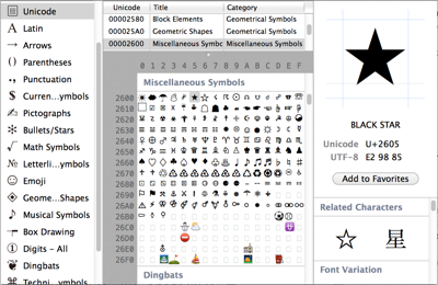 The stars are displayed using a character from the Unicode character set, the black (filled) star, represented by
 ★ and set to white with CSS.
Such characters can be referenced in general with character entity expressions that begin with & and end with ;. In between, if they are decimal numbers, they start with #, and if they are hexadecimal, they start with #x, like ★ for the star.
The same star is duplicated twelve times but transformed with a rotation, further each time, to produce the circle of stars.
Programs like Adobe Illustrator can provide a better means to draw more complex illustrations or extract vector drawings from images, which can then be exported to SVG.
Rewrite the above SVG for the US flag so that it has a wave in it. Hint: instead of rectangles, design paths using a quadratic Bezier curve.
